
In most companies today, the list of software just keeps growing. New tools get added to meet new demands, but old ones rarely get turned off. This common scenario quickly creates a complex, expensive, and tangled web of “application sprawl” and “technical debt.” When things get this complicated, it becomes almost impossible to tell which applications are actually worth the money and effort.
This is precisely where Application Portfolio Management (APM) comes in. It’s a practical method for getting a handle on all your software. It helps you catalog, review, and streamline everything to make sure your IT portfolio visualization aligns with business goals.
But just having a list isn’t enough. To make smart decisions, you need to see the data clearly. Effective Application Portfolio Management Dashboards are key. They cut through the noise by boiling down all that complex data into simple, clear charts. This level of application dashboard visualization helps everyone, from IT leaders to business managers, understand the big picture at a glance. Let’s walk through what APM is, why visuals are so important, and look at some of the best ways to display this information using APM tools like Enterprise Architect and Prolaborate.
Get a guided walkthrough of Sparx Systems’ Application Portfolio Management and Visualization capabilities.
The Complexity of Modern Application Portfolios
Think about how many apps a modern enterprise uses. It’s often hundreds, sometimes thousands, built up over many years. The result is often a messy, confusing landscape: data is scattered everywhere, you might have three different tools that all do the same thing, and sometimes no one is even sure who’s in charge of a specific application.
Beyond the obvious licensing fees, the hidden costs of trying to connect, maintain, and train people on this jumble of systems can quietly drain the IT budget and slow down critical projects.
The first step to fixing this is to create a complete inventory—a single source of truth for every application. This means logging key details for each one: How much does it cost? What technology does it run on? Who uses it, and how much business value does it really provide? Once you have this clear inventory, it becomes much easier for leaders to spot the overlaps or find the “ghost” applications that are still running (and costing money) but no longer needed. APM tools like Enterprise Architect are perfect for this, allowing you to build this catalog, model the connections between systems, and generate clear reports.
What Is Application Portfolio Management?
APM is essentially the practice of managing your company’s entire collection of software as a single portfolio, much like a financial expert manages an investment portfolio.
The goal is to manage every application from the day it’s bought to the day it’s retired, always asking: “Is this helping the business, or is it getting in the way?” This process is all about making smart decisions to optimize costs (like cutting redundant licenses), manage risks (such as outdated, insecure software), and rationalize the portfolio by removing low-value tools.
You might have heard of Application Lifecycle Management (ALM), which focuses on building and maintaining a single product. Application Portfolio Management is bigger. It looks at the entire landscape and how all applications work together (or don’t) to support the company’s main goals.roducts to the entire portfolio, offering a holistic view of how applications support business capabilities and priorities.
Why Application Dashboard Visualization Matters in APM
Let’s be honest: no one wants to sift through a 50-page spreadsheet. Raw data in tables makes it incredibly hard to spot the connections between an application’s cost, its risk, and its business value. You just get lost in the details.
This is why IT portfolio visualization is so critical. These dashboards do the heavy lifting, turning all that complex data into simple, intuitive charts that tell a story. Suddenly, you’re not drowning in numbers anymore.
Dashboards get everyone on the same page, fast. They allow IT and business leaders to have productive, strategic conversations instead of arguing about whose spreadsheet is correct. It makes it easy to explain to non-technical stakeholders why a certain application needs to be retired or replaced, using a picture that speaks for itself.
Visual APM Options and Use Cases
The best dashboards always start with a question. Are you trying to cut costs? Find hidden risks? Plan for the future? Once you know the question, you can pick the right visual to answer it.
In APM tools like Sparx Enterprise Architect and Prolaborate, you have a wide range of dashboard widgets designed specifically for APM. Here are some of the most common Prolaborate widgets and visualization options:
Bubble Chart
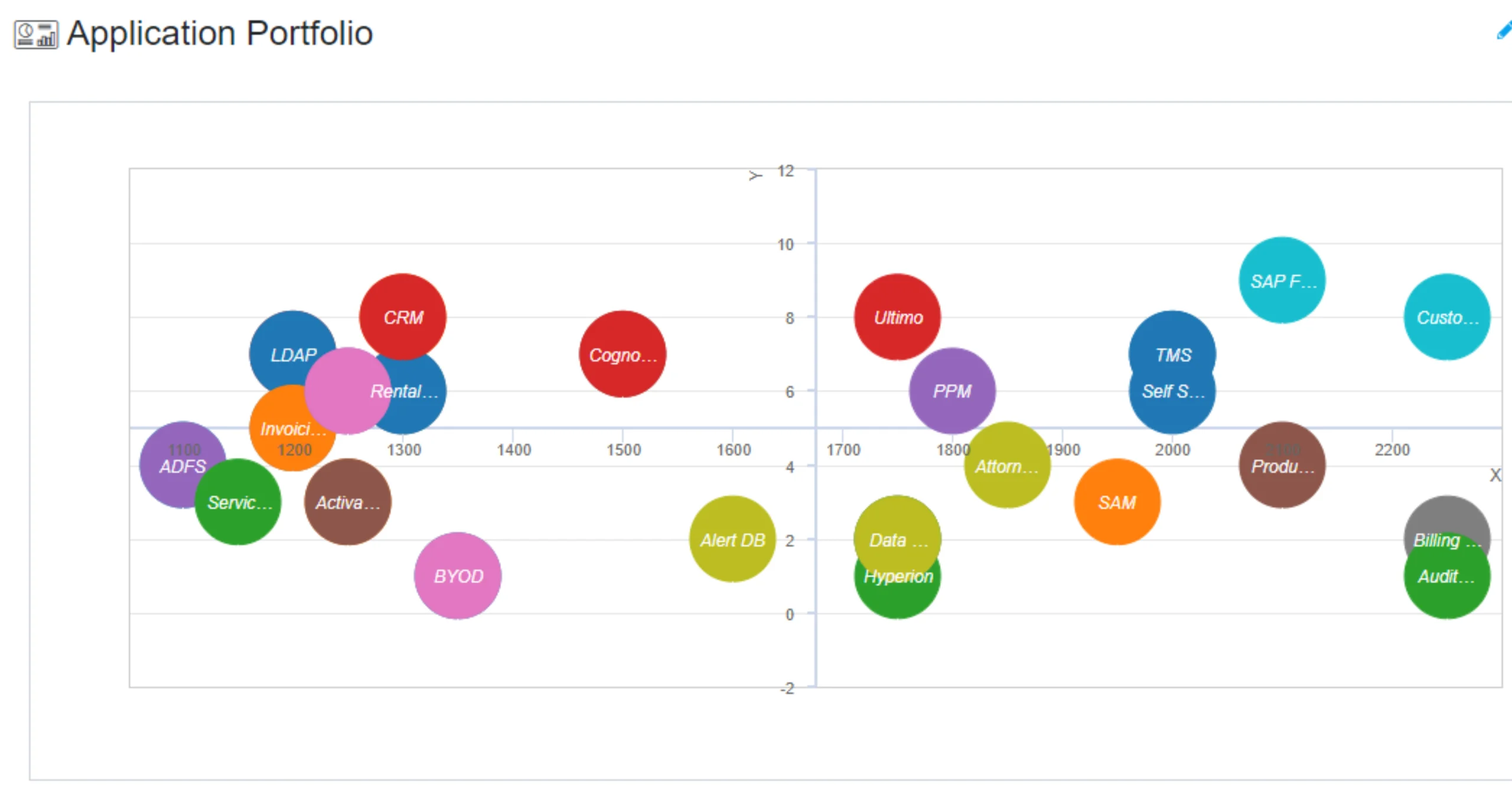
See multiple data points at once. You can plot apps by cost, value, and risk. The bubble’s size can show total spend, helping you instantly spot expensive, low-value applications, which is a key part of application rationalization via bubble charts.
Heat map

Quickly see the application health of your portfolio. Heat maps use color to show patterns in usage, performance, or security risks, letting you instantly identify trouble spots.
Bar Graph

The classic for a reason. It’s perfect for making clear comparisons of costs, user numbers, or business benefits across different applications.
Pie Chart
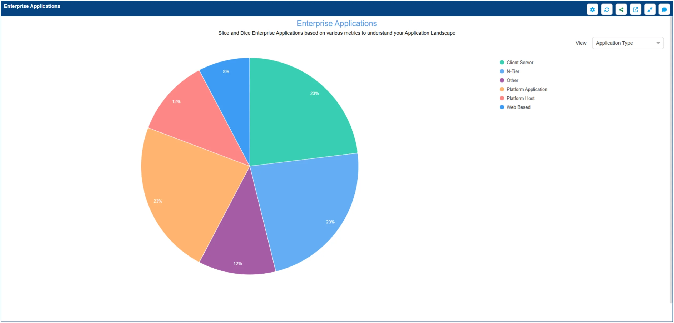
Best for understanding proportions. Use it to visualize risk exposure by showing what percentage of your portfolio is high-risk, or how much you’re spending per business unit.
Lifecycle Roadmap

This is your planning tool. A lifecycle roadmap visualizes the timeline for every app (past, present, and future), making it easy to plan upgrades and manage technical debt.
Card Widgets

For your ‘at-a-glance’ numbers. These card widgets provide instant portfolio insights by highlighting single, important metrics like “Total Critical Applications” or “Average Portfolio Health Score.”
Landscape View

Connects the dots between IT and business. These application landscape views use capability maps to show exactly which applications support which business functions, instantly revealing gaps or overlaps.
Choosing the Right IT Portfolio Visualization for Decision-Makers
With all these options, the key is to match the chart to the decision you need to make:
- If you need to weigh value against risk for your top 20 apps, the bubble chart is your best bet, as it can handle multiple dimensions.
- Trying to figure out where the money is going? A bar graph gives you a crystal-clear comparison of costs across the portfolio.
- Want to show the leadership team your risk exposure? A pie chart can effectively show the proportion of high-risk vs. low-risk applications.
- For day-to-day monitoring of operational health, heat maps are ideal for spotting patterns.
- When it’s time for strategic planning, the lifecycle roadmap is essential for visualizing upgrade timelines, while landscape views help align your entire portfolio to business capabilities.
- And for that high-level executive summary, a few card widgets with key numbers can tell the whole story in seconds.
Discuss scope, data model and dashboard setups with our experts and plan a practical starting approach.
As businesses rely more and more on technology, managing the application portfolio isn’t just an IT task; it’s a core business function. A structured APM process, brought to life with clear application dashboard visualization, is the most effective way to cut through the complexity. It helps teams stop guessing and start making informed decisions about costs, risks, and business alignment. Using the visualization features in tools like Enterprise Architect and Prolaborate provides the clarity needed for these important conversations.
To make this work, you need two things. First, a solid foundation: a complete application catalog with a consistent way to score your apps (on value, cost, risk, etc.,). Second, a commitment to keeping it alive. This means clear data ownership and a regular schedule for refreshing the data. A dashboard is only as good as the data behind it and keeping it trustworthy is what turns one-time reports into long-term, strategic Application Portfolio Management Dashboards.


