
Your Sparx Systems Enterprise Architect models contain the definitive truth of your IT landscape, yet their full potential is realized only when stakeholders can intuitively consume and act on that information.
The real value of Application Portfolio Management (APM) emerges when you focus on Defining the Right KPIs for APM and make them visible to decision-makers. Building a dynamic application portfolio dashboard in Prolaborate bridges this gap, transforming static architecture into dynamic, metric-driven insights.
Effective APM dashboards avoid the trap of showing everything. Instead, they focus on key metrics to answer specific questions:
- Where are we spending?
- Where are we exposed?
- Where are we duplicating?
- Where should we modernize first?
Our Experts can help jumpstart your APM with well-defined decision-grade metrics, aligned governance and role-based dashboards.
Deciding the Dashboard Purpose
(Cost, Risk, Redundancy, Modernization)
Before configuring any widgets, you need a clear purpose for each dashboard. Successful portfolio dashboard design dictates that one dashboard should drive one primary conversation. For example, distinct dashboards should exist for “spotting redundant applications by domain” versus “tracking the modernization backlog.”
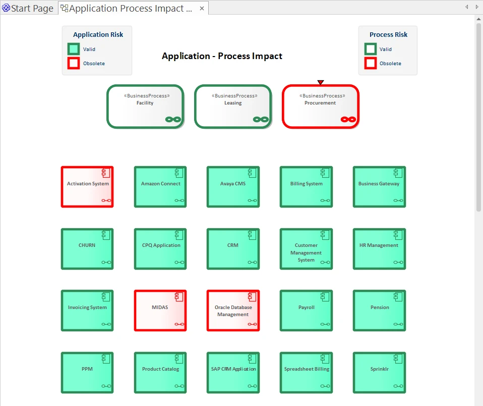
Typical APM dashboard themes include:
- Cost: Identifying where expensive applications reside, which domains and platforms consume the majority of the budget, and where low-value apps are consuming “Run” spend.
- Risk: Highlighting clusters of poor technical health, End-of-Life (EOL) technology, or open risk findings.
- Redundancy: Pinpointing where multiple applications support the same capability or process, or where similar solutions exist across different regions.
- Modernization: Tracking which applications are tagged for Retire, Rehost, Rebuild, or Replace, and monitoring the progress of those plans.
Selecting Sparx EA’s APM Data & Model Elements for Visualization
Prolaborate dashboards are only as good as the EA data they sit on. To achieve meaningful Sparx EA visualization, you must start by Building an Application Inventory in Sparx EA to select a small, relevant slice of data rather than overloading the dashboard with every field in the model.
For APM dashboards, the essential ingredients usually include:
- Application Elements: Stereotyped as your APM “Application” type, populated with fields for owner, domain, lifecycle, hosting, and scores.
- Scoring and Classification Fields: This requires Designing APM Scoring Models covering Business value, technical health, risk, cost bands, and rationalization options (TIME).
- Relationships:
- Applications → Business Capabilities
- Applications → Business Processes
- Applications → Technologies and Integrations
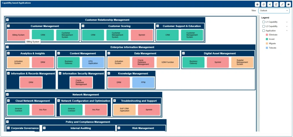
For each dashboard, deliberately pick which subset of applications to display (e.g., specific domains or lifecycle states) and which fields tell the story (e.g., cost band + criticality for cost dashboards).
Sparx Prolaborate Charts, Matrices, and Heatmaps for APM
Once the data is selected, Prolaborate widgets turn it into readable portfolio views and Analytics, KPIs & APM decision dashboards. You do not need complex visuals to start; a few well-chosen tables and charts are often sufficient to make APM patterns visible.
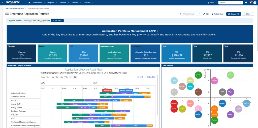
Common Patterns
- Tables / Matrices:
- Lists of applications detailed with columns for domain, owner, lifecycle, business value, technical health, risk, cost band, and rationalization option.
- Matrices such as “Capabilities → Applications” to highlight redundancy (visualized as multiple apps mapped to a single capability).
- Charts:
- Bar charts showing apps by lifecycle, hosting type, or risk band.
- Pie charts for high-level breakdowns (e.g., apps by rationalization option).
- Stacked bars combining dimension and domain (e.g., high-risk apps grouped by business domain).
- Heatmap-Style Views:
- Two-dimensional views like “Value vs. Tech Health” or “Risk vs. Cost,” approximated using filters, sorted tables, and colored columns.
- Using an APM heatmap style allows you to generate quadrant-style insights to identify targets, such as “High Value + Low Tech Health” indicating a need for modernization.
Dashboard Examples
1. Redundant Applications Dashboard
This view provides portfolio and domain architects with a concrete picture of where consolidation opportunities exist.
- Key Widget: A capability-application matrix (or list) showing capabilities supported by multiple applications.
- Key Chart: Simple charts for “Apps per Capability by Domain” to highlight areas with the highest redundancy.
2. High-Risk / Low-Value Apps Dashboard
This view serves as the starting point for “quick-win” rationalization or decommissioning discussions.
- Key Widget: A table filtered to applications with high risk or poor tech health combined with low business value.
- Key Columns: Cost band and rationalization option, allowing users to quickly identify low-value, high-risk, high-cost candidates.
- Key Chart: A grouping of these apps by domain or platform to reveal the most problematic pockets of the portfolio.
Role-Based Access to Dashboards
Not every stakeholder needs to see every dashboard. In Prolaborate, role-based access keeps dashboards relevant and safe. You can maintain focus by creating specific APM Stakeholder Views in Prolaborate:
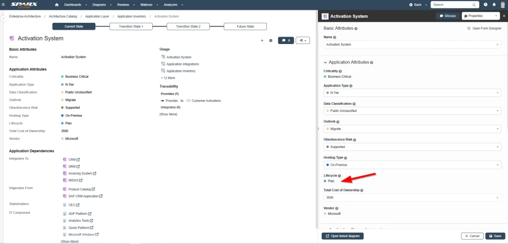
- Assigning Dashboards to Roles:
- Executives see high-level counts and trends.
- Domain Architects see detailed application lists and capability maps.
- Application Owners see “My Applications” lists and review tasks.
- Restricting Edit Rights:
- Architects maintain the structure and metamodel in EA.
- Owners and SMEs update specific fields via Prolaborate forms.
- Specific Groups retain exclusive rights to change rationalization options or strategic scores.
Keeping Dashboards Actionable
A dashboard is useful only if people know what to do after looking at it. The best APM dashboards behave like a living cockpit: used regularly in portfolio forums, with follow-up actions feeding back into the EA model.
To ensure actionability:
- Answer Specific Questions: Ensure every view addresses a clear issue, such as “Which applications do we need to rationalize in this domain?” or “Which high-criticality apps are still on legacy tech?”
- Provide Obvious Next Steps:
- Include links from dashboards into detailed application views.
- Add filters that allow teams to slice data for specific meetings (by domain, region, or lifecycle).
- Use Prolaborate Reviews to turn a filtered list into a formal decision-making session.
- Keep Maintenance Lightweight: Avoid overly complex logic that relies on a single person’s knowledge. Build dashboards on top of simple, well-defined EA fields and relationships.
Cut Months of Setup into Days—Start with Proven Sparx Application Portfolio Management Templates
Turning Application Portfolio Data into Decisions
Ultimately, a well-structured Prolaborate dashboard transforms your Application Portfolio from a static repository into a dynamic decision-making engine. By surfacing the right metrics to the right people, you move beyond simply modeling the architecture to actively managing it.
Whether it is identifying cost savings, mitigating risks, or accelerating modernization, these dashboards provide the clarity needed to drive strategic change. When stakeholders can see the landscape clearly, they can navigate it confidently, turning your EA models into a true catalyst for business value.


