
Trying to manage a growing portfolio of applications can be overwhelming, and many teams run into common challenges when adopting APM. To figure out what’s healthy and what needs attention, raw numbers just aren’t enough. Visual dashboards for Application Portfolio Management (APM), and heatmaps in particular, are built to make sense of this chaos. They translate complex metrics into a simple, visual format. In a single screen, you can instantly see which applications are performing well, which are being underused, and where warning signs are starting to pop up. This gives everyone a common picture to ground the conversation about priorities and what to do next.
Modern IT environments produce a constant stream of data: response times, transaction counts, customer satisfaction scores, security alerts, and more. Trying to find trends by reading these line by line in a spreadsheet isn’t just slow; it’s a recipe for missing something important. A heatmap cuts through that noise. It organizes all that data into a simple grid of colored cells, making outliers and patterns immediately obvious. As a monitoring tool, it provides a quick, reliable read on the health of your entire portfolio, helping teams spot trouble before it impacts users.
Hands-on training covering model setup, portfolio attributes, and dashboard configuration for Application Portfolio Management (APM) use cases.
What Is a Heatmap?
At its core, a heatmap is just a grid, like a spreadsheet. But instead of numbers, it uses color to represent values. Think of it like a weather map. Darker or more intense colors usually mean “more” of something (like high error rates or heavy usage), while lighter shades mean “less.”
For APM, you might list your applications down one side and key metrics (like response time, user adoption, or compliance status) across the top. The color in each box then does all the work, showing you the state of that specific metric for that specific app.
Common variations include:
- Calendar heatmaps: Show patterns by day, week, or month.
- Matrix heatmaps: Compare several different metrics across many applications.
- Geographic heatmaps: Place data on a map to show regional differences.
No matter the type, the goal is always clarity. A heatmap fails if it’s just decorative. To be useful, it needs a logical color scale, clear labels, and just enough context (like what the target numbers are) to make the colors meaningful.
Application Health Monitoring with Heatmaps
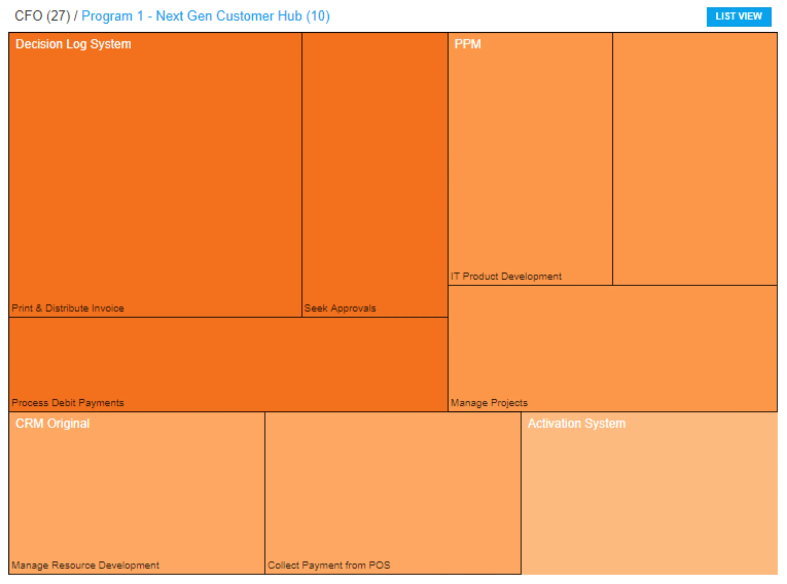
Heatmaps give you a quick, visual report on operational health. When you track the right things, emerging trends and sudden problems become obvious. Good metrics to track include:
- Performance: Response time, error rate, and throughput to check if you’re meeting SLAs.
- Usage: Logins, transactions, and active sessions, maybe broken down by department.
- Compliance: Patch status, audit findings, and policy checks.
- Cost efficiency: Showing cost next to usage to see if you’re getting your money’s worth.
- Customer satisfaction: NPS scores and support ticket volume to flag user pain points.
When you color-code these metrics across your whole application list, the problem areas just jump out. This tells you exactly where to start digging. The best heatmaps are interactive. When connected to your application inventory, you should be able to filter, sort, and drill down. For example, clicking a bright red “high errors” cell should ideally open up the recent incident reports for that app, complete with notes on what’s going on.
You can also use heatmaps to track application portfolio changes over time. By putting time on one axis, you can watch how performance or user adoption changes week by week or even seasonally. This is also great for comparing different business units or regions to see who is using an application and who might need more training.
Identifying Underused or Overburdened Applications
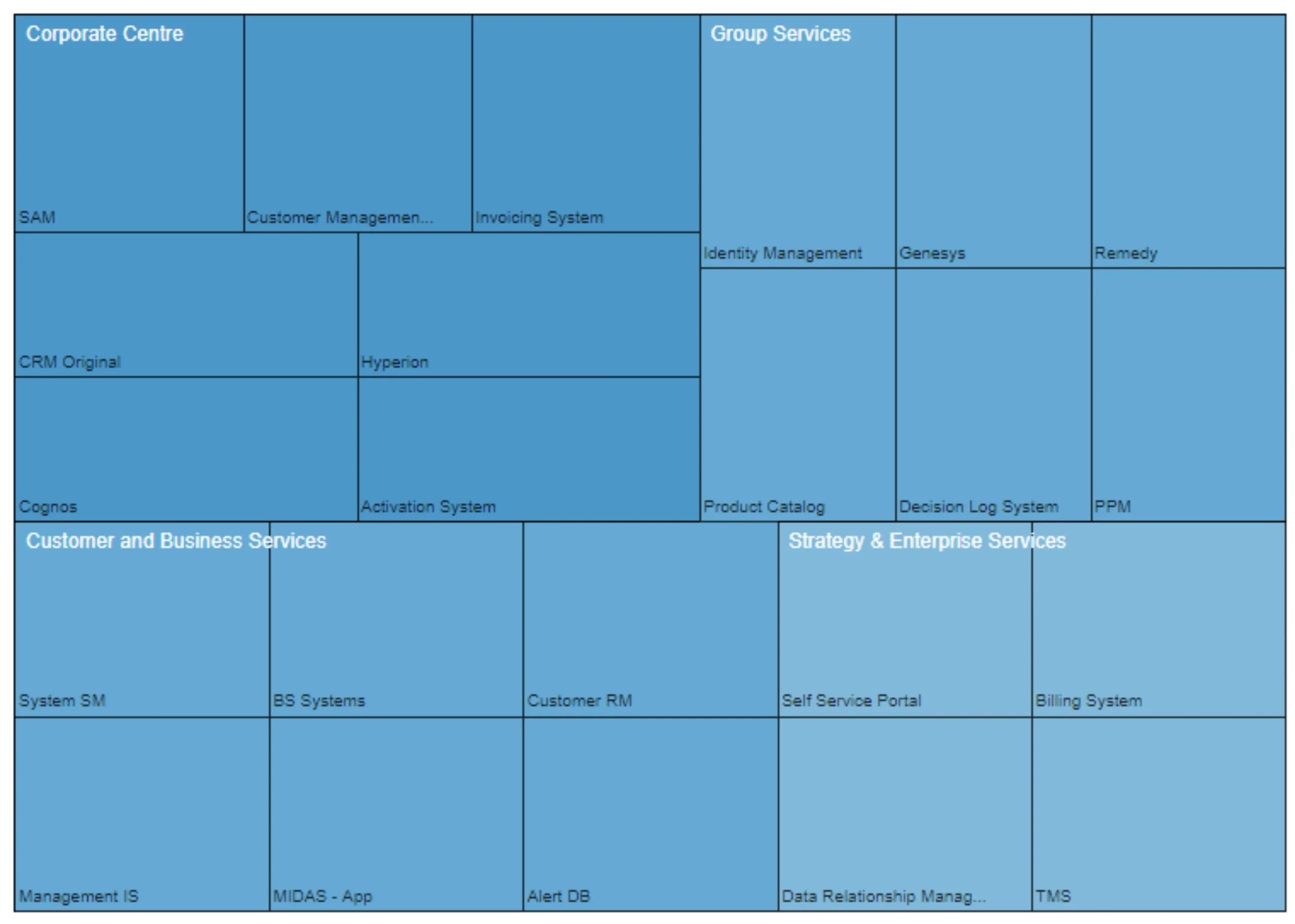
One of the most powerful uses for a heatmap is finding the extremes: the apps no one is using and the ones that are about to break.
Spot Underutilized Applications
Look for low usage combined with high cost. An old reporting tool that only has a handful of users but costs a lot to maintain will stick out immediately. These are prime candidates for retirement.
Detect Overburdened Services
On the other end, look for high usage paired with slow response times or rising errors. This is a clear sign that a service needs to be scaled up or modernized.
Recognize Seasonal Patterns
You can easily see retail apps get slammed during the holidays or payroll systems peak at the end of the month. This helps you plan capacity when it matters.
Compare Business Units
See big differences in adoption? Maybe the sales team in one region loves the new tool, while another isn’t using it at all. This shows you exactly where training is needed.
This kind of feedback makes it much easier to prioritize improvements and make smart budget decisions. When you combine what the heatmap tells you with cost and value data, your APM strategy isn’t just a guess; it’s based on solid evidence.
Benefits of Heatmaps for Collaboration

Heatmaps aren’t just for analysts. Their real power is getting everyone on the same page.
- Bridge IT and the business: A simple color-coded chart communicates a problem far faster than a spreadsheet full of numbers. This lets business leaders join the conversation about priorities and funding without needing a technical deep-dive.
- Support incident response: When a problem hits, a shared, real-time heatmap gives everyone the same view of what’s happening, helping the team move from “what’s broken?” to “it’s fixed” much faster.
- Sustain continuous improvement: Reviewing heatmaps in regular meetings keeps everyone focused on real-world trends, not just isolated incidents.
Ultimately, a heatmap is both a tool for analysis and, just as importantly, a simple communication tool that helps teams make better decisions together.
Creating Effective Heatmaps in APM
A heatmap is only as good as its design. To create one that’s actually effective, keep these points in mind:
Select Relevant APM Metrics
Don’t try to cram everything into one chart. Focus on the metrics that matter for your goals (cost, usage, performance). If you need to see more, use a separate view.
Normalize mixed scales
If you’re comparing response time (milliseconds) with user counts (thousands), the colors won’t make sense. Convert them to a common scale (like percentiles) first.
Choose appropriate color scales
Use a simple, sequential scale (like light to dark blue) for “more vs. less.” Use a diverging scale (like blue-white-red) to show “above or below a target.” Always include a legend.
Design for accessibility
Pick color palettes that are easy to distinguish, even for people with color vision differences. Adding tooltips that show the exact number on hover is also a big help.
Provide context
A red box is alarming, but what does it mean? Add labels, show the thresholds, and provide brief notes so people can correctly judge the situation.
Enable interaction
A static image is a report. A working view lets you explore. Add filters (by business unit, region, etc.) and drill-downs to make the heatmap a true dashboard.
In advanced APM tools like Sparx Systems Prolaborate, heatmap widgets can be set up to refresh automatically from your Enterprise Architect models. Teams can also use templates to standardize layouts, which ensures everyone is looking at the data in the same, consistent way.
Pitfalls and Best Practices
Even strong visuals can be misleading if you’re not careful. Watch out for these common traps:
- Data overload: Trying to show 500 applications and 20 metrics on one screen just creates visual noise. It’s better to group applications or use different, layered views.
- Unclear scales: If people don’t know what the colors mean, they will draw the wrong conclusions. A legend is non-negotiable.
- Hidden variability: Using a 30-day average can hide a massive spike that happened yesterday. Provide ways to adjust the time window.
- Lost context: Vague labels on the axes make the whole chart useless. Name everything plainly and clearly.
Following these simple practices will help keep your heatmaps accurate and genuinely useful for making decisions.
Get a guided walkthrough of Enterprise Architect + Prolaborate dashboards, and visualization use cases tailored to your portfolio and priorities.
In the end, heatmaps work because they turn scattered operational data into clear, actionable patterns. They help leaders spot waste, see where services are under pressure, and make critical decisions based on shared facts, not just hunches.
When used as part of a regular review process, tools like Sparx Systems Prolaborate, which connect heatmaps directly to your APM data models, move you beyond just seeing the data. They help you build a consistent process for improving your application performance and, most importantly, the experience for your end-users.


