
Effective Application Portfolio Management (APM) is determined by the quality of its insights. Organizations often struggle with a surplus of raw data and one of the common challenges in adopting APM is making effective success tracking difficult. This is where APM KPIs and metrics come in. These measurement indicators are what distinguish actionable information from irrelevant data, helping you identify where to optimize costs, reduce risk, and invest strategically. Without a solid KPI framework, leaders are often forced to guess which applications truly deliver value and which are simply draining resources.
This article outlines the practical application of APM metrics. We will cover what to measure, how to calculate those figures, and where to find the data. Additionally, we will explore how to set realistic targets, build dashboards for different roles (a process often called dashboarding), and establish a rhythm for reviewing your data and acting on it.
Our Experts can help jumpstart your APM with well-defined decision-grade metrics, aligned governance and role-based dashboards.
KPI Categories: Cost, Risk, Technical Health, Business Value, and Agility
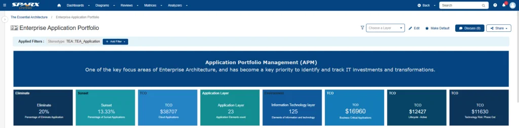
A common mistake is to focus too heavily on cost. A truly effective APM strategy, often guided by established APM frameworks, standards, and best practices, takes a comprehensive view. By balancing metrics across five key areas, you get a complete view of your portfolio health metrics and avoid the common pitfall of optimizing one area (like cost) at the expense of another (like business value or security).
Cost
Understand the complete financial footprint of your applications, often visualized using bar graphs to track application costs and value, beyond the initial purchase cost.
- Total run cost: Licenses + support + infrastructure + third party services.
- Cost per user/transaction: Total run cost ÷ active users or transactions.
- Opex vs. Capex mix: Track the split between ongoing operational expenses and capital investments.
- Goal: Use these figures to identify high-cost applications that are good candidates for rationalization or cost-saving efforts.
Risk
Proactively identify and manage issues before they become critical problems.
- Security exposure: % of applications with critical vulnerabilities.
- EOL/obsolescence: Count of components past vendor support (e.g., outdated servers or libraries).
- Compliance status: Adherence to mandatory controls (like GDPR, HIPAA, or PCI).
- Goal: Use these risk KPIs to trigger remediation plans immediately, often supported by pie charts that visualize risk exposure across the application portfolio.
Technical Health
Identify which systems are brittle, complex, or difficult to maintain.
- Defect density: Defects per KLOC (or per sprint/release).
- Integration complexity: Number and criticality of interfaces. A high number can signal a fragile application.
- Technical debt index: A score from static analysis tools that quantifies maintenance overhead.
- Goal: Pinpoint which systems are overdue for refactoring or modernization before they fail.
Business Value
Measure how much an application actually contributes to the business.
- Adoption/usage: Active users, utilization rates.
- Outcome impact: Its contribution to revenue or its importance for a mission-critical process.
- Stakeholder satisfaction: Net Promoter Score (NPS) or qualitative feedback from key users.
- Goal: Use these business value KPIs to justify continued investment in high-performing systems (even if they are costly) and identify what’s not being used.
Agility
Measure how quickly you can respond to new business requests.
- Lead time for change: The total time from request to deployment.
- Release/deployment frequency: How often you can deliver production changes (daily, weekly, quarterly?).
- Change failure rate/MTTR: How often do your changes fail? And how quickly can you recover (Mean Time to Recovery)?
- Goal: Find the bottlenecks that slow down your ability to deliver new features and updates.
Formulas & Data Sources
Metrics lose their value if the data isn’t trusted or if calculations are inconsistent. The key is consistency. Create a central “KPI dictionary” that defines exactly how each metric is calculated and, just as importantly, where the data comes from.
Cost formulas
- Total run cost = Licenses + Support + Infrastructure + 3rdparty services
- Cost per user = Total run cost ÷ Active users
- Sources: Finance systems (e.g., SAP), procurement contracts, usage analytics, cloud billing dashboards.
Risk metrics
- Vulnerability score from security scanning tools.
- Compliance score = % of mandatory controls successfully implemented.
- EOL risk based on vendor support status and roadmaps.
- Sources: Vulnerability management platforms, GRC (Governance, Risk, and Compliance) tools, vendor documentation.
Technical health metrics
- Defect density = Defects ÷ KLOC (or other unit of size).
- Integration complexity = A weighted count of interfaces.
- Technical debt index from static code analysis tools.
- Sources: Static analysis tools (e.g., SonarQube), CMDBs, integration catalogs, APM tools.
Business value metrics
- Value score from stakeholder surveys, weighted by the outcome’s business impact.
- Satisfaction via NPS or targeted user surveys.
- Sources: CRM data, user survey tools, stakeholder interviews.
Agility metrics
- Lead time for change and deployment frequency from CI/CD pipeline logs.
- Sources: DevOps pipeline tools (e.g., Jenkins, Azure DevOps), ITSM platforms (e.g., ServiceNow).
Manually collecting this data is highly inefficient and prone to errors. A best practice is to store these formulas and thresholds directly within your architecture metamodel (like in Enterprise Architect). You can then use tools like Prolaborate to streamline the data collection, ensuring your metrics are always up-to-date and reliable.
Targets & Thresholds (RAG Definitions)
A number by itself doesn’t tell you whether to act. That’s why these measurement indicators need context for effective success tracking. By setting clear “Red, Amber, Green” (RAG) thresholds, you give every metric a clear meaning. These bands should reflect your organization’s specific goals and tolerance for risk.
- Cost bands: For example, Green < $X per user/month; Amber $X–$Y; Red > $Y. (You’ll likely want to adjust these bands based on the application’s tier or importance).
- Risk limits: A critical vulnerability shouldn’t be “Amber”—it’s an immediate “Red.” Likewise, any component past its end-of-life (EOL) is a “Red” until it’s remediated.
- Technical health: Set maximums for defect density or complexity. Exceeding them automatically triggers a review for refactoring.
- Business value: If an-application falls below a minimum adoption or business contribution score, it becomes a clear candidate for retirement.
- Agility: You might define “Green” as deploying weekly (or better), while “Red” is anything quarterly or worse.
Role Based KPI Dashboards
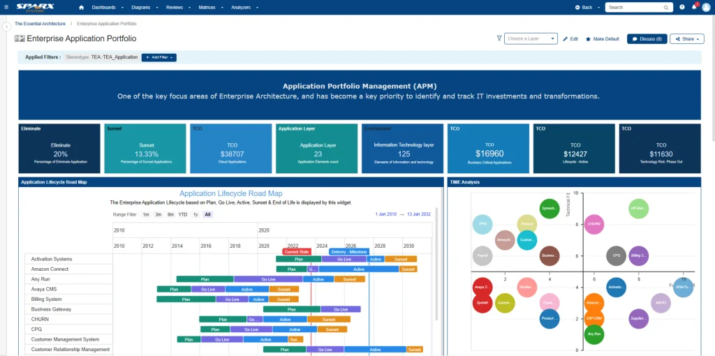
Not everyone in the organization needs to see every metric. An executive, a portfolio manager, and an engineer all have different questions. A good KPI dashboard is tailored to the decisions a person needs to make, not just to the underlying data.
Executives
- Portfolio size and lifecycle distribution (e.g., how many apps are “end of life” vs. “strategic”?).
- Total run cost and spending trends.
- Top 10 high-risk/high-cost applications.
- Savings pipeline and benefits actually realized from rationalization.
Portfolio Managers
- Breakdown by business unit, capability, or technology stack.
- Bubble charts showing Cost vs. Value vs. Risk (with filters for drilling down).
- Drilldowns into specific application domains and ownership.
Technical Teams
- Lists of apps with high technical debt or complex integrations.
- Agility metrics (lead time, deployment frequency, change failure rate).
- Direct links to architecture diagrams and code repositories.
Risk & Compliance
- Vulnerability and EOL heatmaps showing status and remediation progress.
- Dashboards showing controls coverage and audit readiness.
Review Rhythm & Acting on Outliers
Great dashboards are a start, but the real value comes from acting on them. Metrics are only useful if they lead to decisions and follow-through. This requires a consistent review rhythm.
- Monthly reviews: On a regular basis, portfolio leads and application owners should review their dashboards. Proactive alerts can flag any metric that breaches a threshold.
- Quarterly governance: At a higher level, combine the KPI trends with your funding and prioritization cycles. This is the forum to agree on major remediation efforts.
- Action plans: When planning application modernization using APM KPIs and Metrics, every “Red” metric needs a plan. For each outlier, decide whether to: retire, refactor, upgrade, replace, or renegotiate. Assign a clear owner and a due date.
- Benefits tracking: When you take action, track the results. Did you save the money you expected? Did the risk score go down? Report these realized benefits against your forecast.
- Continuous improvement: Your business constantly evolves, and your KPIs should evolve with it. Revisit your metrics annually to ensure they still make sense. You may find you need to add new ones, like sustainability or AI adoption, as priorities shift.
Cut Months of Setup into Days—Start with Proven Sparx Application Portfolio Management Templates
Ultimately, APM metrics and KPIs serve one primary purpose: moving from guesswork to confident, data-driven decisions. When you track the correct metrics—balancing cost, risk, health, value, and agility—you get a clear view of your overall portfolio health metrics and create clarity for the entire organization. By defining your formulas, setting clear RAG thresholds, and building role-specific dashboards, you focus everyone’s attention on what matters most. A steady review process ensures that this data actually leads to action.
Using tools like Enterprise Architect, Pro Cloud Server, and Prolaborate helps you integrate these processes. You can streamline the data collection, calculate the metrics, and publish a powerful visual dashboard that keeps your portfolio secure, aligned with your strategy, and prepared for future challenges.


